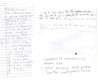

One of my feedback was 'simple yet effective', I am pleased with this because I did not overcomplicated my album cover on purpose, because from my secondary research of album cover presented very simplistic album covers especially the portrait based covers. I was inspired by these covers, and therefore replicated the conventions used.
Negative Points
I received no negative points
Back Cover
Evidently from my audience feedback ...
Positive points
'Colours don't clash with the front cover'
'Positioning of song titles very nice'
'Stands out against white background'
I am pleased with my feedback, as my target audience did not believe that my colour schemes clashed, this is effective, as it suggests that they are of one product, and therefore are similar.
Some thought that the positioning of my song titles were 'mnice' I am pleased with my results.
They believed that Temi stood out well against the white background, therefore the feedback from my primary research suggesting that my artist should be placed against a white background, was valuable in terms of capturing what my target audience would be attracted to
Negative Points
It is clear that from the feedback, my target audience suggested that I include the Logo of the record label as it lacked authenticity. I will be including the Logo, which I will be locating from Google images.
Editing after the feedback

Audience Feedback Inside covers


Evidently from my audience feedback ...
Inside (left)
Positive points
Evidently from my audience feedback it presented to me that the majority of my target audience felt that the colour scheme of the red title 'stranger' and the red colour of Temi's hair was very effectual. I am pleased with the results, as I purposely included the colour red to connote love, which clearly relates to the lyrics of the song stranger, which is present on the cover.
I am happy that the majority of my target audience could read the lyrics on the cover. 'Lyrics are very clear' 'lyrics stand out' I am extremely happy with my feedback because it is very important that my target audience can read the lyrics on the cover, and if they couldn't there will be no point.
Inside (right)
Evidently from my audience feedback It is clear that my target audience believe that 'Lola Cruz' is 'pretty' has 'perfect skin', 'beautiful'. To some degree her 'prettiness' to some degree of traditional representation that her display is passive and objectified for the male gaze regardless of her audience. However due to the re-appraisal of feminist values, where they began to assert their right to be sexually attractive. Temi is shown as attractive, which can also be an opportunity for the female gaze, this reveals that in a way I am conforming to codes and conventions of R&B digipaks, as I am arguably representing the artist for the male gaze, however I am challenging the codes and conventions of the R&B genre in relation to female artists where female artists are presented as subordinates, however 'Lola Cruz' is representing independence, which however conforms to the Soul genre, where 'girl power' is promoted.
No comments:
Post a Comment