Here is the CD cover research section, where I will be exploring the various album covers of different styles and layouts. I will need to explore these aspects to help develop and gain ideas for when it comes to creating our own CD cover. There are a wide range of techniques and effects which are applied. But first I will briefly explain a CD template layout.
1. To advertise and identify the contents of the music product.
2. To convey the artistic aspirations of the original artists
3. In reproductions of the artwork, to serve as a primary image in the promotional efforts surrounding the product, as an identifiable image associated with it.
I have found the general conventions of an album cover front, back, spine and inside: (http://www.slideshare.net/charlinbeth/conventions-of-an-album-cover)
1. Conventions Front Covers:
A simplistic colour scheme
A simplistic design
Few or no characters
Few or no characters
Use of a different colour for the band name compared to the rest of the cover
Hidden meanings
A title that explains to the audience what the album will be about
Bold, simple fonts for the band name
Similar or entirely opposite font for the album title
Bold, simple fonts for the band name
Similar or entirely opposite font for the album title
2. Conventions Back Covers:
Name of band at very top
Name of album at the bottom
List of song titles, usually centred
Barcode in the bottom right hand corner
Name of record company
Copyright and year
Who owns the copyrighted material
Who the album has been distributed by
3. Conventions Insides:
3. Conventions Insides:
Colour scheme that is the same as the rest of the album
Blank, plain background
No characters
Few or no text
4. Conventions Spines:
Blank, plain background
No characters
Few or no text
4. Conventions Spines:
Name of the record company in recognised font, or logo
Name of band
Name of album
Both in the same simplistic fonts
Code linking to the record company<!--[if !supportLineBreakNewLine]-->
<!--[endif]-->
DEFINING CD ALBUM COVERS
Portrait – particularly consistent on album covers promoting solo artists. The viewer is forced to look directly at the face on the cover, helping them to focus completely on them with no distraction. This cover from Beyonce shows the face of an innocence yet seductive. This supposedly entices the viewer into buying the record, as it is advertising something different, something you wouldn't see in real life.


CD COVER TEMPLATE LAYOUT

From this you can clearly establish the measurements of the height, length and width of a typical CD cover. This is something I must take into consideration when I produce my CD cover, possibly using this as an accurate guideline to help me progress.
Over the decades since album covers were revolutionised, there have been many controversial album covers. Aspects of artwork associated with sexuality/nudity, religious beliefs, trademarks have been either banned or dismissed due to violence, graphical content or plagiarism. Here are a few examples, which I have again extracted from ‘Wikipedia’ (despite my earlier judgements of wikipedia as an unreliable source, I have now concluded that it is still useful, as a majority of the information is true) :
SEXUALITY/NUDITY
RED HOT CHILI PEPPERS- MOTHER’S MILK (1989)
The album cover features a black and white photograph of the band sprawled across the arms of a proportionately larger naked woman. A rose conceals one of her nipples while Kiedis’ standing body conceals the other. Several national chains refused to sell the record because they believed the female subject displayed too much nudity. A stricter censored version was manufactured for some retailers that featured the band members in far larger proportion than the original.’
Album Cover: 1
Front cover
'I AM Sasha Fierce', is the third studio album, By Beyonce Knowles who is a famous R&B recording artist. It was released on November 2008. by Columbia Records, which was distributed in several countries.'
On the album Beyonce's image is the main focal point, which allows the audience to focus on her primarily, in comparison to the text on the cover. The colours are dull, and simple, which correlates with her facial expression, and her make up. This suggests the innocence of the album; the cross on her wrist also promotes purity. However she looks quite seductive, through her facial expressions, (through her eyes). It can be suggested that she is an object for the Male Gaze. There is minimal texts on the cover, which consists of her name and the name of her album cover. This moreover allows the audiences attention to be mainly on her
'I AM...' is written on the right hand corner which makes the audience turn the album cover to reveal the end of the sentence.
Album Cover 1
Back Cover
 Again Beyonce is the main focal point. Her pose is very seductive, this contradicts the cross around her wrist on the front of her album cover. However, 'Sasha Fierce' is written on the back cover, after 'I am ...' on the front cover, which reveals and exposes the two sides of Beyonce to her fans. I AM being, very pure, Sasha Fierce being very intense and seductive. The colour scheme is also very dull on the back, only including colours black and white. White can connote a successful beginning, which can relate to the beginning of her new side 'Sasha Fierce' and black can connotes a mystery. Beyonce is wearing one of the outfits from her music video 'single ladies' Her track name is very small, and it is in plain text, this also makes the main focus to be on Beyonce.
Album Cover 2
Front Cover
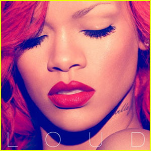
'Loud is the fifth studio album by Barbarian recording artist Rihanna. It was first released on November 2010, by Def Jam Recordings.' Yet again Rihanna is in the foreground of the shot, and is the main focal point of the image, which draws the audiences attention straight onto her. Rihanna is well known for her red hair,as she has braced us with her red hair in her music video 'only girl.' the cover, projects her red hair with photo editing techniques, and moreover enhances her red lips. With the combination of her red hair and her red lips this can connote strength and power.
In addition to some degree it indicates 'sexiness' , some traditional interpretations of the use of 'sexiness' believe that she is a representation of a sexual object, however the way she dominates the whole cover shows a more modern positive representation of females too
Her lips are in the centre of the the album cover, this may have been done to emphasise that Rihanna is becoming a very successful artist, and now has the voice to speak out 'LOUD'. The red in its self is loud.
Rhianna's name doesn't appear on this album cover, this suggests that she is now a well established artist worldwide, which connotes how powerful she is. Moreover her eyes are closed which limits interaction between her and the audience, however it gives a sense of a mystery which intrigues the audience to find out more, as nothing is revealed.
Album Cover 2
Back Cover
Album Cover 2
Back Cover

The back of the cover, in contrast with the front, has much softer colours making Rihanna seem a lot more vulnerable, and pure compared to the front cover. The angelic image will appeal to young girls/teenagers as it is very feminine, and pretty but still has an edge with the use of the red tint and red writing. Rihanna has developed a star image for herself over time, according to Andrew Godwin this is a key aspect of success in this industry. The font is very simple, and it only uses capital letters, this shows a link between the front cover 'LOUD' and the 'CAPITAL LETTERS' on the back. The song titles are on the right hand side on the back cover, to prevent attention being taken away from Rihanna.
Album Cover 3
Front Cover

'Still Standing is the sixth studio album by American R&B recording artist Monica. It was released on March 2010, by J.Records.'
On the album cover, the close up of Monicas face is in the foreground of the shot, she is the main focal point in comparison to the text on the cover 'STILL STANDING.' This draws the audiences attention straight onto her, the artist, for she is the most important factor on the cover. The colour tone of the album is very bright, this can represent her successful beginning of her album for she is 'still standing.' The brightness of her album cover enhances her natural make up which can connote her purity, and innocence. The text 'MONICA' is written in plain text, however the letters M, and A m are extended, this subtly crafts a crown shape, over her head, which can represent her independence moreover the way she dominates the whole cover shows a modern positive representation of females, for she is promoting her freedom, and self determination.
Album Cover 3
Back Cover

The back cover, is relatively similar to the front cover, for they are
both aesthetically pleasing to the eye, with its simplistic use of mono-toned colours, yet they're both equally detailed. The back cover however the medium shot Monica on the left of the cover, reverses the attention away from the artist Monica, this can connote that her songs are more important for her fans hence why they are written in capital letters. Similarly to the front cover Monica is still looking into the cameras, having excellent eye contact with her target audience, this can attract them to the CD, and moreover dis allows them to lose interest, for Monica is 'inviting' them into her album/CD
The spine, includes the artist name 'Monica' which is similar to the font used in the front cover, and moreover the album name.
Album cover 4
Front Cover

'I Remember Me' is the second studio album by American recording artist Jenifer Hudson released March 2011, on Arista Records.' The medium shot of Jennifer Hudson presents her reaching out away from her own body, this may connote her distance between and her old self and her new self hence why her album says 'remember me'. The colour purple may be evoking gloom and sad feelings, this can be related to Jennifers feelings about her old self. In contrast the background looks quite soulful, which can be associated with the genre of her songs. The text is very minimal, and moreover reveals itself in the purple background, this suggests that her name and the album name is still important to her audience,

Similar to the front cover, the colour scheme remains purple. Jennifer looks quite seductive in her tight purple dress, which according to Laura Muvley, it can be identified as a tool for the 'male gaze'.
Jennifer's sad facial expression may suggest shame and regret when she remembers her old self, moreover this is emphasised by the fact that Jennifer has no eye contact with the audience, and the direction of her eyes are focused onto the text (I remember me).
Moreover the luxury cream prop behind her connotes luxury, and could be seen as her comfort.
Lastly the focus is directly on Jennifer whilst the background is blurry. This suggests that Jennifer is still important, and the attention should be primarily on her, the attention could moreover be on her because she is revealing to the audience her new self.


Their CD
Evidently,
After researching into the covers of CD covers, I also thought it was important to look into the spines of the Case, which is an important feature because it shows the audience who the CD is promoting and what it is.

All four spines represent different things, but there is a clear sense of continuity in each in regards to their own case.
All of the top three spines, include both the artists' name and the name of the album, which is easy information to include and show the audience.
In contrast, Taylor Swift's spine does not include the name of the album but instead promotes the record deal 'Big Machine records'. All of which can be included in the spine.
All four also show the reference number of the CD album, which could be there for marketing purposes.
‘
Before I start to create my promotional package for my artist (who I have not yet selected a stage name for) it is important that I identify the target audience, so that the material that I include will be suitable and appeal to the right people.
To identify my target audience of those who buy albums, and moreover generally R&B fans, I did some secondary research on the Internet, and a media booklet I found in my media sixth form study room. I identified that the genre R&B is arguably aimed at '13-25 year old's moreover it is aimed at 'black and white audiences, but primarily the black audience'. In addition it is aimed at both genders, ' because the corporates aim to maximise their revenue by appealing to as large an audience as possible.'
I then looked deeper into how I could personally target my audience, through having discussions with people aged 13-25, focusing my decisions on what they expect to see in an R&B (soul) album cover/ case/ poster (I said poster because the front cover of an album can be similar to an album). By doing this I will be able to develop an understanding about the demands and interests of my target audience.
Here is some of the responses/comments I received:
Female 17 - 'I have all Chris Browns' albums, he always looks sexy in all of them'
Me - 'Which album of his do you think is the best and why ?'
Female 17 - 'All of them, they're always close ups of his sexy face'
Male 19 - 'I will only buy an album cover if it looks attractive that's how gullible I am' *laughs*
Male 16 - 'I don't really expect much from an R&B album cover, it depends on who the artist is'
From my discussions, I had with my focus group has helped me plan out what I will be including and disapproving within the production of my package. I will not be making my album cover very busy, I am going to keep it as simple as possible, as one said that 'when there is too much going on, it removes the interest of the artist.' Evidently from my research above of album covers,, most of them are very simple, for example Monica, Beyonce and Rihanna's album covers, are close ups of their face. I assume that this has been done to keep the interest primarily on themselves as they can be seen as the most important source of the their cover.
I have had thoughts from my discussions that my album cover should relate to the narrative of the music video, this can be done subtly with facial expressions, lighting, clothing etc... For example Jennifer's album cover shows her hands reaching away from her body, this can represent her escaping from her old self. This relates to her 'I remember me' music video.
Even though the demographics are young females, they still have a sex appeal to the male audience. Laura Mulvey argues that this voyeurism involves turning the represented figure itself into a fetish (object) so that it becomes increasingly beautiful but more objectified
In order to appeal to the audience, I must find a market that I can fill. In terms of the design of the CD cover, I could experiment with a variety of shapes and sizes. However, the most convenient and expected CD cover would be the conventional 12×12 square shape. I shall conform to these rules for ease in terms of production. This leaves the niche to be on the actual visual aspect of the cover.
No comments:
Post a Comment