Wednesday, 19 December 2012

Magazine Advertisement Research

http://www.slideshare.net/mccabekat/media-studies-theory-for-as-and-a2#btnNext
I had a look at this slide share, and it made me understand the theory of media in a bit more depth. I will be applying more theories into my work.

Advertising is a form of ccommunication for marketing used to encoutage or persuade an audience (viewers, readers or listeners; sometimes a specific group) to continue or take some new action. Most commonly, the desired result is to drive consumer behaviour with respect to a commercial offering.


Conventions of magazine adverts are:
Song/Album title
Visual links to the video - Intertexuality
Reviews (Newspaper, Music press, Celebrities/DJ's-Trend Setters)
Condensed information on content
Release date
Artist name
Where it is available to purchase (iTunes, HMV, Amazon)
Record Label Logo
Website (official artist site)

                ADVERTISEMENT ANALYSIS
Rihanna's magazine advert involves a close up of Rihanna, where there is large focus on her face, this immediately attracts her fans attention, because they can easily recognise her face, which therefore I assume, may boosts the sales of her album as in our modern society, keeping up to date is crucial, especially with Rihanna's demographic target audience of the female gender from as young as 11. The uses and gratification theory of the integration and social interaction approach suggests that identifying with others, and gaining a sense of belonging enables one to connect with friends and society. So therefore, Rihanna's target audience especially in the age ranges of 11-17 (considered the peak of para social relationships with celebrities) may be interested to connect and interact with their friends
Rihanna's album name on the advertisement 'only girl in the world' suggests to me that it appeals to a mass market, of girls all over the world, however it can be identified as a niche market due to the fact it is appealing to mainly girls.
There is valuable information included on the advertisement, for example the release date. The use of the text, applying it to the uses and gratification theory of the information approach the audience may use this to satisfy their curiosity, and gain a sense of security (for example exclusion from peers) through this knowledge
The largest word is the album name 'LOUD' so it draws the viewers attention to the album name, then the second largest word Rihanna which draws the eye there, then they'll read the rest of the poster. This boost sales
Conventions
♫  Song/Album title - Evidently the album title 'LOUD' has been included on the advertisement
♫ Visual links to the video - The image that has been used of Rihanna is similar to exactly how she is presented in her music video 'only girl in the world', as she also has bright red hair in her music video, and her make up is practically the same.
♫ Condensed information is present 
♫ Release Date - 'November 16 2010' is very bold and stands out, to reveal to the audience the date they can purchase the album. The text 'coming' suggests that it is quite scarce, according to the Elaboration Likelihood of the Peripheral Route, it suggests that if the audience perceive that the product is scarce, they are more likely to be persuaded to purchase it.
♫ Artist name - Evidently 'Rihanna' is presented on the advert, however her name is written smaller compared to the album name and the release date. I believe that she is such an established artist in the music industry that her face alone allows the audience to identify her with, therefore her name being present is unneeded, and doesn't require that much attention from the audience.
♫  Where it is available to purchase - Unfortunately I cannot see where the album is available for purchasing the album. However the small text at the bottom may be that piece of information


♫ Song/Album title - The title of Chris Brown's album is 'Fortune' which is written in symbols
There is a small printed snapshot of his album cover 
Strangely the Release date is not present. However as a follower of Chris Brown on the social networking site 'Twitter' I can recall Chris Brown constantly informing us (his fans) about the release date of his album.
Artist name - Chris brown is written in small font compared to the album name
Record Label Logo - The record label logo is printed on the bottom right hand corner on the page
Website (official artist site)

Promotion of Chris Browns Album Fortune (http://en.wikipedia.org/wiki/Fortune_(album))

On November 18, 2011, "Strip", featuring Kevin McCall, was made available via iTunes Stores worldwide as a buzz singlefor the album. The song achieved moderate success, reaching number 37 on the US Billboard Hot 100, and number three on the US Hot R&B/Hip-Hop Songs chart In January 2012, Brown released the first promotional photo for Fortune, which showed him posing against a white backdrop, dressed in a full length fur coat, black hoodie and jeans.At the 54th Grammy Awards, held at the Staples Center in Los Angeles, California on February 12, 2012, Brown performed a medley of "Turn Up the Music" and "Beautiful People" The performance featured Brown dressed in a white and grey varsity jacket, white pants and sparkling sneakers, performing heavily-choreographed routines with several dancers, atop a collection of blocks. On February 26, 2012, he performed a truncated version of "Turn Up the Music" during the half time show of the 2012 NBA All-Star Game in Orlando.

From reading this piece of information I found on Wikipedia it is clear to me that there are various promotional deeds a celebrity has to accomplish besides photographic advertisements. Such as performances, appearances, moreover there were projected images on the stage backdrop, and BMX bike of Chris’s stunts on stage. This further widened my knowledge, why some magazine advertisements are not as n depth as they could be. I am assuming this is because they have to perform various promotional activities, so therefore the artist themselves personally inform their fans.


The main image on the page is of the artist Jessie J, it takes up the entire single spread page. Jessie J is looking directly towards the camera, with her face positioned straight. She is holding her hands stabilized to the two sides of her temples and she is expressing her mouth in a shocked/disgusted manne
Jesse J’s makeup is all black and moody which links well with the genre she portrays which is R&B.

‘Jessie J’ has been presented in the centre of the page in gold it looks reflective almost like jewellery, this potentially connotes her wealth.
Underneath Jessie J’s album title has been presented in white, italics font which is less noticeable than her name. This may have been done so that her fans recognise her name easier, and therefore more persuaded to buy her album.
There I reference to a previous well sold record of Jessie J, which entices the reader and makes them feel intrigues.
At the bottom of the page there is reference to Jesse J’s website which makes it simple and accessible for the reader, to find out more information due to modern technology that is used in today's society.
Running throughout the advertisement is a clear colour scheme of black, gold and white making it look professional and appealing

Inspiration


To sum up my research these characteristics are of the typical conventions I have found out.

Name of band/ artist and album

- date of album release

- bands image/ style

- featuring songs

- form of release (CD, download)

- either photograph or artwork as main image

- record company

- bands website – myspace /official page

- critical quotes, ratings

- sponsoring company – institution logo/name/ website, adding credibility to the band

- own style of font which runs through advert – fitting with genre

- photograph of band itself- usually use album cover as main image/ album insert

- where to purchase the album -distributor

- All of conventions elements are dependent on the genre of music

- either half page, quarter page, or full page layout- album cover or image itself may only take up a small section of the advert page


I will be implementing as many conventions as I believe I can replicate, in order to increase authenticity.

Monday, 17 December 2012

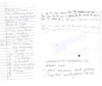
Audience feedback - Digipak


Front Cover
Evidently from my audience feedback ...
Positive points
Evidently from my audience feedback it presented to me that the majority of my target audience felt that the close up image of the artist 'Lola Cruz' was very attractive, and moreover they felt that her eye contact attracted them to the album especially.  I am happy with my results, due to the fact that my close up of Temi was effective, and drew them to the cover.
Some of my target audience revealed that the font I used went well with the genre, (R&B/Soul) I am happy with this because it shows that I have followed the conventions of an R&B/Soul album cover, therefore allowing them to identify the genre quite easily.
One of my feedback was 'simple yet effective', I am pleased with this because I did not overcomplicated my album cover on purpose, because from my secondary research of album cover presented very simplistic album covers especially the portrait based covers. I was inspired by these covers, and therefore replicated the conventions used.
Negative Points
I received no negative points
Back Cover
Evidently from my audience feedback ...
Positive points
'Colours don't clash with the front cover'
'Positioning of song titles very nice'
'Stands out against white background'
I am pleased with my feedback, as my target audience did not believe that my colour schemes clashed, this is effective, as it suggests that they are of one product, and therefore are similar.
Some thought that the positioning of my song titles were 'mnice' I am pleased with my results.
They believed that Temi stood out well against the white background, therefore the feedback from my primary research suggesting that my artist should be placed against a white background, was valuable in terms of capturing what my target audience would be attracted to
Negative Points
It is clear that from the feedback, my target audience suggested that I include the Logo of the record label as it lacked authenticity. I will be including the Logo, which I will be locating from Google images.

Editing after the feedback


Audience Feedback Inside covers
View Album cover spine.png in slide show


Evidently from my audience feedback ...
Inside (left)
Positive points
Evidently from my audience feedback it presented to me that the majority of my target audience felt that the colour scheme of the red title 'stranger' and the red colour of Temi's hair was very effectual. I am pleased with the results, as I purposely included the colour red to connote love, which clearly relates to the lyrics of the song stranger, which is present on the cover.
I am happy that the majority of my target audience could read the lyrics on the cover. 'Lyrics are very clear' 'lyrics stand out' I am extremely happy with my feedback because it is very important that my target audience can read the lyrics on the cover, and if they couldn't there will be no point.

Inside (right)
Evidently from my audience feedback It is clear that my target audience believe that 'Lola Cruz' is 'pretty' has 'perfect skin', 'beautiful'. To some degree her 'prettiness' to some degree of traditional representation that her display is passive and objectified for the male gaze regardless of her audience. However due to the re-appraisal of feminist values, where they began to assert their right to be sexually attractive. Temi is shown as attractive, which can also be an opportunity for the female gaze, this reveals that in a way I am conforming to codes and conventions of R&B digipaks, as I am arguably representing the artist for the male gaze, however I am challenging the codes and conventions of the R&B genre in relation to female artists where female artists are presented as subordinates, however 'Lola Cruz' is representing independence, which however conforms to the Soul genre, where 'girl power' is promoted.


Sunday, 9 December 2012

Digipak?

It seems that I did not fully understand what a Digipak was, I thought a digipak, was just another word for an album cover, that involved the front cover and the back cover

This is what i found on Wikipedia (http://en.wikipedia.org/wiki/Digipak), after typing in what is a digipak...
Digipaks typically consist of a gatefold (book-style) paperboard or card stock outer binding, with one or more plastic trays capable of holding a CD or DVD attached to the inside.
Since Digipaks were among the first alternatives to jewel cases to be used by major record companies, and because there is no other common name for Digipak-style packaging is often used for CD singles or special editions of CD albums and the tall DVD Digipak (DVDigipak)  is used as a premium package for DVDs and DVD sets. Such packaging is less resistant to abrasion than jewel cases, so it tends to show signs of wear relatively quickly.
Digipak-style cases grew in popularity among record labels and recording artists in the early 2000s.

After reading this, I then understood that a digipak is more than just the front cover and back cover however it resembles a book-style card, binded with bind.. To gain full understanding I then researched on google images what an album digipak actually looked like
I found this...


Now I understood very well, and now I will be completing my entire digipak.

Saturday, 8 December 2012

Editing my Digipak


My album / Dgiak cover Idea


Image: In my album front cover, I will have a close up of the artists face in the middle of the cover, this is because I have decided to implement the Portrait based cover, where the artist is the main focus on the cover. This therefore forces the viewer to look direct;y at the face on the cover, 'Lola Cruz'
The viewers will therefore be forced to look directly at the face on the cover, helping them to focus completely on them with no distraction.
Female stars are often referred to glamorous and attractive , therefore they are seen as 'eye candy' to appease the male gaze of the male audience. When I do take my photographs I hope to achieve a successful picture where my artist can be seen as 'eye candy' to appeal the male gaze of the male audience
David Gauntlett argues that in contemporary society gender roles are more complex and that the media reflects this. He points out that female role models today are often glamorous as well as successful in a way that previously they were not. He states that much of thus is due to the rise of 'girl power' and 'women independence  in the media, though identities constructed by 'women independence. I believe that the rise in girl power has increased in our society today, due to the movement of feminists asserting their independence. This assertion has recently been increasing in the R&B/Soul genre, for example the release of Beyonce Single Ladies, which I believe is promoting independence in females, Moreover even though their main demographics are young females, they dress and illustrate themselves in a manner that will attract the  male gender towards them as well. This helps to increase awareness and widen their audience.


Album Name & Artist Name : One convention I noticed in my secondary research (portrait based album covers) is that the album name is often either small compared to the image or it is written in fine text.
The majority of my target audience wanted the font and lettering to be simple . I have purposely placed the text on the bottom right hand corner of the page, this is because I would prefer to focus completely on the artist, rather than the texts. I discovered this technique from my album cover research of Solo artists using the Portrait based cover.


After the research of what a digipak was, I then drew up another plan for the two other boards to create...


My photoshoot. Pictures

I like this close up because Temi has 100% eye contact with the audience  this creates a sense of involvement between the audience, and the album cover. Temi achieved the seductive look in her eyes, this is beneficial because the majority of my target audience suggested that this was the facial expression they expect to see in an R&B/Soul genre album cover.
I believe that the 'cheek piercing' and the 'nose piercing' conforms to the stereotypical conventions of the R&B genre, due to the fact that the artists always promote their jewels. Silver often connotes wealth, which is also the qualities of an artist. Unfortunately you can see a lot of imperfections on her face, so therefore if I decide to use this shot, I will edit this picture, possibly I will use the 'air brush' tool to give her a flawless look.


I like this subtle high angled close up of Temi because yet again she has good eye contact with the audience, which makes them feel involved and therefore may potentially be interested my album cover.
I believe that the close up, enhances Temis facial expressions, which is beneficial in a Portrait Based album cover, which I will be implementing. As my chosen colour scheme involves the colour white, this is why she is wearing white, to promote innocence, and also due to the votes from my questionnaire.

I like this medium close up of Temi, for many reasons,
Firstly I like  the body position of Temi because she is 'flaunting' her outfit, by positing her body away from the camera whilst raising up her shoulder. The idea that she is flaunting her outfit is a common convention in especially R&B album covers, (evidently from my secondary research). In contrast Temi has her face tilted towards the camera whilst engaging the audience with her excellent eye contact, moreover Temis facial expression is very seductive, which according to Laura Mulvey Temi is an object for the Male Gaze. However due to the movement of feminists where they began to question their purpose in the media, Temi can also be identified as an object for the Female Gaze, where other females can look up to her. 
The silver background connotes wealth and glamour which are very common characteristics in especially the R&B genre. Moreover, the silver background enhances her brown skin, which therefore makes her stand out.
To conclude I will be definitely using this shot for the front cover of my album because of all these characteristics.
Applying theory into this image, it has been said that female stars must be glamorous and attractive, therefore they are seen as 'eye candy' to appease the male gaze of the male audience,

have 


I like this medium close up of Temi because she has no direct eye contact with the audience, which relates to the name of her album 'stranger', this is beneficial because the audience will perceive her as a stranger, because she has no involvement with the audience.
The use of the white background, allows Temi to stand out and be the main focus towards the audience.

I like this medium shot because Temi has excellent eye contact with the audience, therefore it may make them feel more involved.
I like the fact that Temi stands out from the white background, therefore she is the main focus towards the target audience.

I like this medium shot of Temi, because Temi once again has excellent eye contact with the audience Temi has her face tilted towards the camera whilst engaging the audience, in addition, Temis sorrowful facial epxression, relates to the narrative of my music video, where she is sad, and hopeless. This is beneficial for the audience to relate to her, and engage empathy towards her. Therefore beneficial for the uses and gratification theory/

I will not be using this high angled shot of Temi because there is a shadow on her face,and this will be extremely difficult to photo shop to remove the shadow


Similarly to the image above there is also a shadow on her face, so therefore I will reject the use of this image in my task

Photoshoot Results & Analysis for my digipak

Photo shoot
Location : In my house behind a white wall
                 And In another location in my house
Duration: 30mins

Today I did my photo shoot, in my house. Unfortunately my original artist Bemi, explained to me that she could no longer be available throughout the entire week and possibly for two extra weeks due to personal issues, as a 'director' I had to use my initiative  and instinctively find an alternative who could replace Bemi. I decided to use my back up 'Temi' who was very willing to be a model for my album cover, and my magazine advert. I explained the process of my coursework,  and I allowed her to watch my edited music video so far, she fully understood the narrative of the music video and  moreover she understood what I expected from her.

My photo shoot, took the course of 2 days within one whole week (Saturday and  Wednesday) This was because on the Saturday that I intended to do my photo shoot behind a white wall, however the room in my house where there was a white wall in my house, was under reconstruction, so therefore instead of cancelling my photo shoot, I just carried it out regardless. 

Saturday Photo shoot
Evidently from my primary research (questionnaire) my target audience expected to see close ups, therefore I decided to take all my pictures as close ups, because I do not want to ignore my target audiences opinion. Moreover the majority of my target audience voted for my 'Lola Cruz' to have a 'Serious& Seductive' facial expression. 
One issue that I experienced today was that Temi, was not quite able to achieve a serious seductive face, she had difficulties constructing the serious face. So therefore I instructed her to replace the 'serious' face with a smile. So unfortunately I have had to eliminate the choices made by target audience.

I followed my plan for my photo shoot effectively, as I ensured that Temi wore exactly what I intended her to wear. Evidently below Temi is wearing the laced top that I explained will be beneficial for my music video. 


I used my Apple iPhone 4S to take my photographs, I do believe that it did a successful job, because my pictures did not come out too dark, compared to the quality of my music video. I used the natural lighting in my house, because It was quite bright already so therefore my pictures came out bright.

Wednesday Photo Shoot
Today I constructed my photo shoot behind a white background in my house. Unfortunately Temi could not wear the same laced top because she had already taken it to the dry cleaners. So therefore I appointed her to wear another white top, because of the results from my questionnaire, One of the biggest issues I had, was that she had dyed her hair red, and cut her hair also. This is why I have decided to use the Wednesday pictures for my magazine advert, because it will contrast the first pictures I had previously taken, and therefore decrease the realism of my album cover.
I still used my iPhone 4S to take my pictures again because I believe that it was successful in my first photo shoot

I believe that I achieved that natural look, by just using minimal make up and nude lipstick, to connote 'Lola Cruz's' innocence.